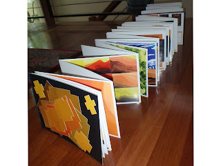
Atlas of colour was a lot of hard work but the end result did make things worth it. I learnt a lot from the workshop, previously I hadn't really considered colours and how they could appear differently through different lights and textures. I also didn't know much about composite colours and how different colours can look good and work well together.
I enjoyed the workshop, it was nice to do painting. the exercise that I liked the most would have to be the face map I found it to be interesting and highly inventive.
Over all I found it to be a worth while course. I enjoyed it a lot.
Monday, September 21, 2009
Face Map

The face map would have to be my favourite exercise. I enjoyed the concept of turning a photo, something that captures real life and and than transforming it into something more abstract. I enjoyed blending colours to create hierarchy and movement and i enjoyed blending other images to create one whole.
Atlas of Colour

With my colour wheel and tonal variation, I found that being left alone and uncropped worked best for my book. It shows that art nor colours need to be streamlined and perfectly cropped to represent art. Art can be represented by anything and is a form of expression. Therefore I believe the impurities gave it character and uniqueness.
Subscribe to:
Comments (Atom)


