Monday, October 26, 2009

Last model making exercise


I enjoyed the last task the most. I enjoyed exploring the word freedom using balsa wood and other materials. As seen in the pictures above my concept was to have balsa wood breaking through my poster which is symbolic of freedom. Once the balsa wood was free it grew an spread out. Each stick was is positioned differently as different people celebrate freedom in different ways. I enjoyed this because I found it an interesting concept joining both the model and the poster together to make one.

Sunday, October 25, 2009

Model Making

Model making was an interesting and challenging workshop. At times I found it hard to produce what the tutors wanted but none the less I found it an interesting exercise. I found it fun trying to produce models out of feelings, words and other objects.

I enjoyed the aspect of having to use different and found materials each week to create something different.

Monday, September 21, 2009

Atlas of Colour

Atlas of colour was a lot of hard work but the end result did make things worth it. I learnt a lot from the workshop, previously I hadn't really considered colours and how they could appear differently through different lights and textures. I also didn't know much about composite colours and how different colours can look good and work well together.

I enjoyed the workshop, it was nice to do painting. the exercise that I liked the most would have to be the face map I found it to be interesting and highly inventive.

Over all I found it to be a worth while course. I enjoyed it a lot.


The End Product


2D Pallette


Face Map


The face map would have to be my favourite exercise. I enjoyed the concept of turning a photo, something that captures real life and and than transforming it into something more abstract. I enjoyed blending colours to create hierarchy and movement and i enjoyed blending other images to create one whole.

Fall applied to section


Tiger interiour


Leaves in Fall


Tiger


Collage Section


Collage Plan


Tonal Variations on a Section


Mountain Layout


Tonal Variation


Atlas of Colour


With my colour wheel and tonal variation, I found that being left alone and uncropped worked best for my book. It shows that art nor colours need to be streamlined and perfectly cropped to represent art. Art can be represented by anything and is a form of expression. Therefore I believe the impurities gave it character and uniqueness.

Monday, August 17, 2009

Portfolio


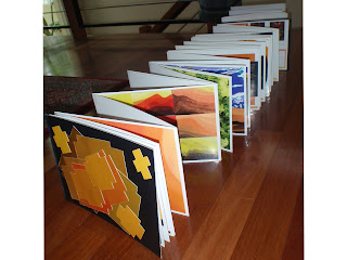
I decided to create my portfolio in an accordion folded book fashion. I felt as if the individual drawings complemented each other and worked well as being viewed as whole rather than individual pieces.

Sunday, August 16, 2009

Picture 14: Filed Trip Drawing


This picture involved time differences and merging different aspects of the building and the surrounding sight into one drawing. I decided to use charcoal and took three different angles. I decided to use the one view looking down over the wood figures, the glass panels in the background, the stairs in the middle ground and the shadows of the wooden ornaments over the stairs.

Picture 13: Field Trip Drawing


This drawing involved water colours . I tried using layers of ink starting from light to eventually going darker to create forms, lightness and darkness.

Picture 12: Field Trip Drawing


I took the angle looking over the wooden ornaments to create this piece. I used charcoal and tried focusing on using lightness, shading and darkness to really discover the different textures and forms of the different materials.

Picture 11: Ink Drawing of Building


The building that was chosen was the Sydney Opera House. Again using lighter layers gradually to darker ones I could create shadows, lightness and forms. This gave the image and building real volume and structure.

Picture 10: Water Colour Plus Another Medium


This is was my favourite exercise. This image involved using water colour and another medium. I decided to use colour oil crayons to really make the subject matter stand out. I enjoyed that the colour added a huge dimension to the artwork. It especially gives the fruit a sweet and colourful appeal making the bowl look almost luminous and fruit like.

Picture 9: Water Colour Movement


Here I created a bold inc container. I tried experimenting with the inc; focusing on how it flows across the page and how i cause use darkness to my advantage.

Picture 8: Fast Ink


I wanted to experiment with lightness and darkness to create a sense of realism. I wanted to show the organic shape and texture of this jug and how different lights can create such volume.

Picture 7: Fast Ink


The main focus was experimenting with colour and darkness. I main aim was to create a really organic and realistic image of a simple object which I feel I was able to do with this pear.

Picture 6: Fast Ink


This drawing was fun as I was able to experiment using water colour in different ways to examine how it flows across the page and what works and what doesn't. I feel as if this picture is quite interesting as it is of simple shapes: blocks, a take away container and a rectangular brush yet portrayed in a different manner allows it to really look much more interesting and appealing.